Accidents from collisions often result in property damage, personal injury, and fatalities, and whether an accident from a collision is minor or severe, the fact is, they are almost always avoidable. The key is visibility, conspicuity, and driver alertness. Conspicuity is defined as the property of being clearly discernible. The state or quality of being clear or bright; brightness; conspicuousness. In other words, making something stand out, so it is easily seen or clearly visible.
The simple fact is that collision reduction can be accomplished through increased conspicuity. Simply stated, we tend not to accidentally hit things that we can clearly see. If you have ever tripped over something or walked into an object at night in your home, it is almost always because you did not see it. So making objects, vehicles, people, buildings, and other objects visible, or conspicuous, reduces accidents.
When talking about visibility, it is important to emphasize that we are talking about objects being visible to the human eye. Once an object or surface is clearly visible to the eyes of an alert individual, they can make adjustments to avoid it. We do this constantly as we drive, but if an object is not clearly visible, we are not able to adjust. So the goal in conspicuity is to make formerly difficult to see objects, conspicuous or highly visible, hence reducing accidents and collisions. Give the eyes and mind information to work with, and they will.
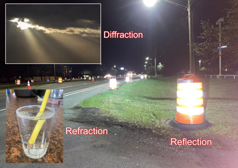
First, it should be noted that collision avoidance is of the utmost importance both day and night, and in both clear and severe weather conditions. So, as we assess how to reduce accidents, we need to focus on improving visibility 24 hours a day in all weather conditions. For all conditions, color, contrast, shape, size, and brightness play a part in the conspicuity of an object. At night, in order for these characteristics to be seen, retro reflectivity is crucial. This type of reflectivity is the ability of an object to return light back to the light source such as a car’s headlights or a spotlight. Without retro reflectivity, color, shape, size, and brightness are non-existent in nighttime conditions. In other words, if an object is invisible, then its shape, how large it is, and color mean nothing.
If you have ever navigated down a ship channel such as the intra-coastal waterway, you will remember that navigational markers are large, uniquely shaped, and made with bright colors. When it is dark, an additional characteristic or feature allows the navigational markers to continue to keep you safe. That is retro reflectivity. Markers are sheeted with reflective material that can be seen for thousands of feet away so that all the characteristics of conspicuity that help maritime navigators in the daytime are also available to them at night. The only additional item needed at night is a bright light pointed in the direction of the marker. Which you will notice, tug boats, commercial vessels and ships have.
On land, the same basic conditions are seen on highways and interstates. You will notice that highway signs are shaped uniquely, positioned high, and constructed with different specific colors of retro reflective sheeting. This assures that they are clearly visible day and night. All of these things make road signs conspicuous and keep us where we need to be as we travel along America’s highways, streets, and interstates. So the question is, how can other objects and surfaces be marked to make them easily visible to the human eye?
Countless studies have been done on visibility and safety, and it has been established that to be easily seen by the human eye, Color, Contrast, Luminance, Motion and Shape are key. All of these factors affect conspicuity and are often what trigger recognition of an object and hence precipitate decisions on how to avoid it. All the factors listed, when implemented properly, assure the best possibility of a person seeing an object and avoiding it. In short, all of these factors harness the power of human vision and our ability to detect objects.
Visibility and the Human Eye
The average human has an approximate 130 degree field of vision. Our central field of vision is where we see detail. This central field of vision makes up only 5% of our total 130 degree field. Our peripheral vision accounts for the rest. For our central field of vision, color is a big factor and helps us identify objects and make decisions involving these objects. However, color alone is not sufficient to locate or distinguish objects or surfaces in our peripheral field of vision. To detect objects in this area, we need contrast, motion and luminance as well as color.
The human eye by itself is an extraordinary creation. The fact that it can relay information to our brains at the speed of light is not only amazing, but also very useful. According to research by Rochester Institute of Technology in New York, the human eye distinguishes color and luminance through two types of photoreceptor cells, cones and rods. Cones are more concentrated at the center of the eye in our central field of vision, while rods are more concentrated towards the outside or our periphery. Cones discern color and detail, and rods are more sensitive to changes in luminance, contrast or movement. Finally, rods require less light to function and are more efficient at night. (source – RIT Center for Imaging Science – 2018)
By design, our eyes are well suited for day and nighttime visibility, provided they are offered something to detect. Offering the human eye the visual input it needs both day and night is the goal of visibility enhancement and accident reduction. The design of our eyes enables us to take in information both a focal level (directly in our line of sight) and a peripheral level (outside of our focal field of vision). As previously stated, motion and changes in luminescence are detected better by our peripheral vision and color and detail are detected better in our line of sight. So, when all the characteristics of conspicuity are engaged – Color, Contrast, Luminance, Motion and Shape – we give our eyes and brain everything we need to detect objects within our 130 degree field of vision, and make adjustments in time to avoid danger.
Elements of Conspicuity
Luminescence
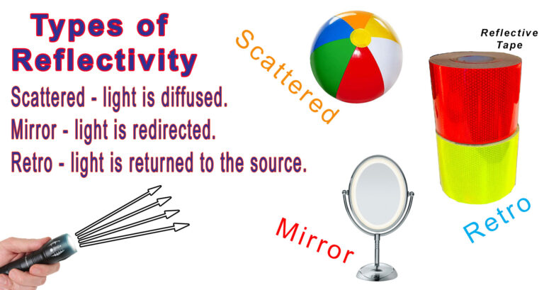
Luminescence is defined as the summed emission of visible light by a substance, object, or material. In other words, it is how vivid or bright something is overall. When we say that something is illuminated, we are talking about the element of luminescence. A standard object reflects day and night using scattered or diffused reflectivity. This is what all objects are able to do except for mirrors that use specular reflectivity.
In the case of retro reflectivity, we are interested in the visible light reflected from an object’s surface to the human eye at night when a retro reflective surface is struck by light. Because retro reflective materials reflect much more light at night than standard surfaces, they are much more illuminated at night than other surfaces. In both scattered and retro reflectivity, the luminance of a surface depends on how much light strikes an object, and how much is reflected or bounced back both in the day and night. As this light is returned and enters the human eye, both the rods and the cones in the eye detect the surface’s brightness, and we are able to make decisions based on this information.
Contrast (Luminance Contrast)
Contrast, or Luminance Contrast, is defined as the difference in the luminance or brightness of two colors. It can be two colors side by side, or one color in front of a dark or bright background. An example is a road sign with a white background and dark letters. The white background makes the dark letters more visible through contrast. This phenomenon is applicable for both day and night conditions, so daytime brightness / contrast and night time brightness / contrast should both be considered in marking a surface for conspicuity.
As you read this article, it is the cones in your eye that let you see the detail and the contrast of the light background and dark letters. This contrast, and the sharpness of the letters, allows you to see and read the words. As you read the words on the page and focus on them, you will notice that you are also taking information in from your peripheral vision. This peripheral information is coming from the rods in your eye. If, while you are reading this sentence, something moves off to one side of you, you will notice it. Also, if there is a bright color with contrast that is out of the ordinary in your periphery, you would see that even more. In other words, an object with sharp contrast and bright colors in your periphery would draw your attention away from the words, to the object.
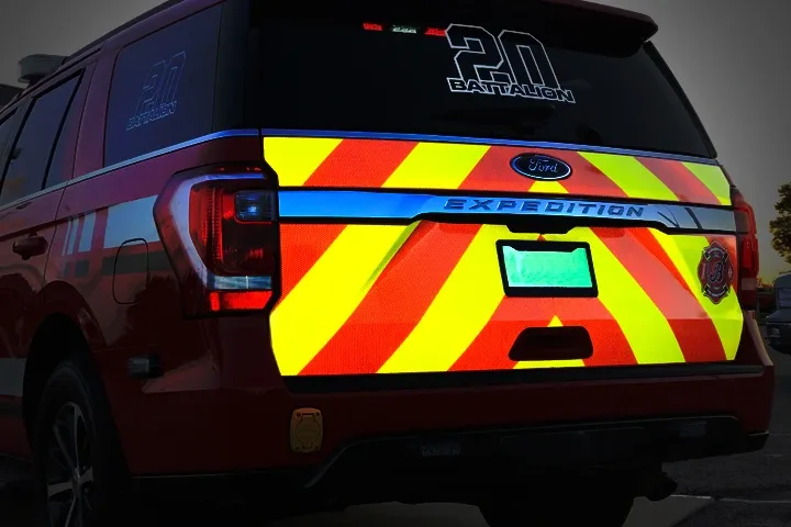
At night, with retro reflective sheeting, the color and retro reflective characteristics of the sheeting both play a role in how visible the sheeting is when reflecting light. Because retro reflective surfaces light up much more than surrounding objects, they create much more contrast. And within a reflective surface there may be two colors which also provide contrast between themselves. Both reflective, but in different colors and brightness. The back of a fire truck with lime and red striping is a good example. In the daytime, the lime and red contrast with each other. At night, the two colors also contrast, and the entire reflective array contrasts itself with everything that surrounds it. So at night, when your lights hit it, the back of a fire truck is more visible than in the day.
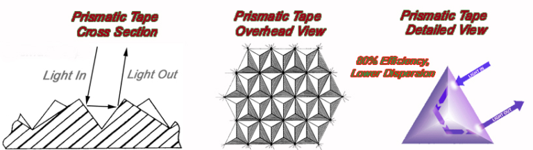
The reflective intensity of retro sheeting depends on its type. (type 1, 2, 3, 4, 5, 9, or 11) For example, a prismatic reflective material (type 4 or above) will be about 5 times brighter than a standard glass bead engineer grade (type 1) material. So at night, both color and reflective film type affect visibility. Because of this, for marking objects that need to be seen a long way away, we recommend a prismatic tape over the less intense tapes because of the increased visibility and contrast that they provide. You can learn more about the different reflective tape types by reading our article – RETRO REFLECTIVE SHEETING GUIDE – ASTM D4956 TYPE 1 – 11
So summarizing, in the day, almost all surfaces will return light using scattered or diffused reflectivity, including retro reflective surfaces. In the day, for all surfaces, color is the main component in how bright or visible it is. At night, however, things are different. A regular object will light up when struck by light using the same scattered reflectivity. However, a retro reflective object, sheeting, or tape will light up much more. This is because it is designed to return light to the source, hence making it much brighter than its surroundings. This also creates great contrast.
Color
Colors are determined by which specific wavelengths of light are bounced from a surface to the human eye. These wavelengths or combinations of wavelengths create what we know as hue or color. Let’s begin with the most visible colors, fluorescents.
Fluorescent Colors – Based on numerous studies, colors such as Fluorescent Lime and Fluorescent Orange are considered to be the most conspicuous colors during the day and in low light conditions. When reflecting, they appear as either a bright yellow or bright orange. Fluorescence is more their daytime characteristic. These special colors are more conspicuous in both the primary and peripheral fields of vision. The main fluorescent colors are lime and orange. Fluorescent lime is commonly seen in school zones and fluorescent orange is seen in work zones. Fluorescent colors are especially visible at dawn or twilight when the ultraviolet light from the sun is present in greater proportions or ratios than in full sunlight.
Definition of Fluorescent – the emission of light by a substance that has absorbed light or other electromagnetic radiation. It is a form of luminescence. Fluorescence makes a color look as if it is glowing.
Standard Red, Orange and Yellow are also conspicuous colors. It is common to mix a fluorescent color with a standard color to achieve more contrast. The most common is a mix of standard red and fluorescent lime. Fluorescent Orange mixes well with green and blue.
More on Contrast
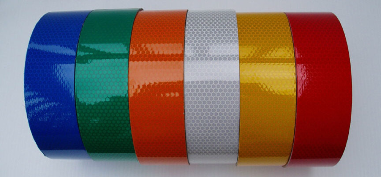
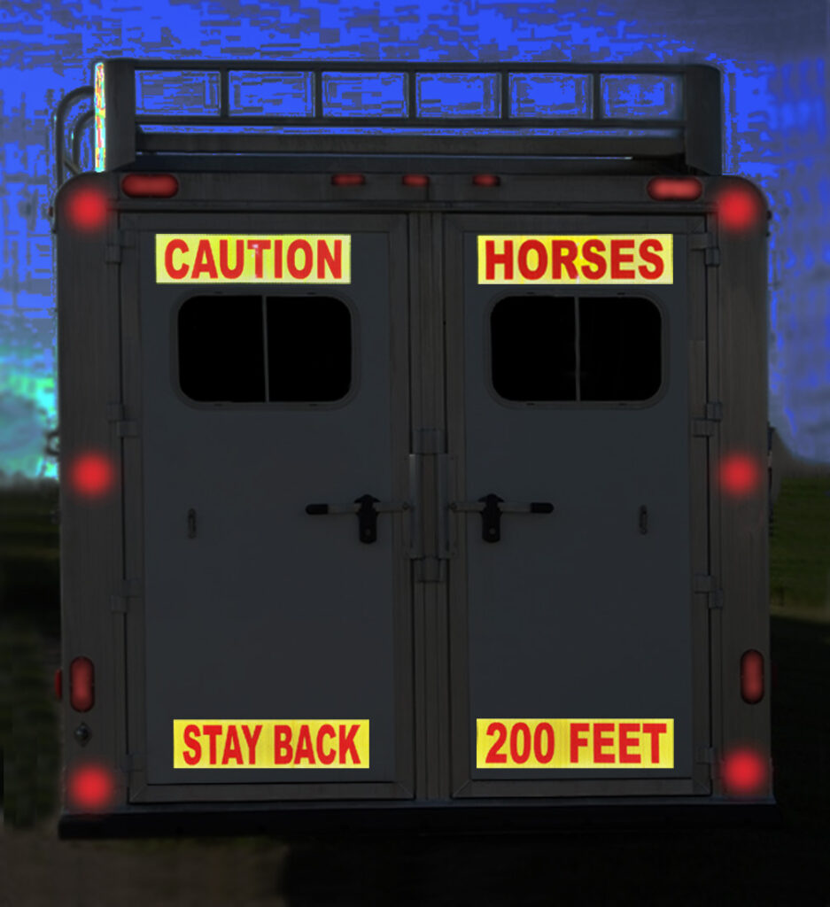
Brightness or luminance is important, but contrast is also beneficial for objects to be visible or conspicuous, especially at night. If you applied fluorescent lime or standard yellow reflective tape on the back of a truck, it would definitely be more noticeable against the dark background of the vehicle. However, by adding a contrasting color, such as red, orange, or blue, to the actual reflective panel or alongside it, you would greatly increase visibility in both the periphery and primary fields of vision. In other words, two colors, especially when reflective, side by side or integrated with each other, draw more attention than a single color. An example of this is the Red and Silver (white) DOT C2 tape on the sides of trucks. Also, the Lime and Red tape on the backs of fire trucks. (see picture above) And finally, the Red and Silver (white) tape on rail road crossing arms. In these examples, two contrasting colors make the tape more noticeable. So, in summary, color is good, but color with contrast is much better.
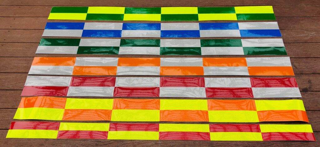
Red is often used with fluorescent lime yellow as a contrast color and is very effective because both colors are conspicuous and bright, and together they provide the recommended 3 to 1 contrast. The most visible reflective panels would be red and fluorescent lime, or orange and fluorescent lime. I would lean a little towards the lime/red because of the contrast. Darker reflective colors like blue and green also provide a 3 to 1 plus contrast ratio, and I personally like those combos. The bottom line is that, at some point, it becomes a matter of personal preference. The picture below shows some sample contrast ratios.
Fluorescent lime and red will give you a 3 to 1 contrast ratio. (Very good because both colors are considered highly visible / conspicuous)
Fluorescent lime and fluorescent orange will give you a 2 to 1 contrast ratio. (ok)
Fluorescent lime and standard orange will give you an approximate 2.5 to 1 ratio. (ok)
Fluorescent lime and blue will give you an approximate 7.5 to 1 ratio (ok – high contrast – but blue has lower candelas)
Fluorescent lime and green will give you an approximate 3 to 1 ratio. (ok)
Shape
The shape of an object or a unique design on a surface has a definite effect on how well it can be seen. This holds true for reflective panels. Panels with 45 degree stripes get more attention, as do Battenberg panels. Angles that we are not used to seeing make an object more conspicuous. If angles are combined with bright colors that contrast each other, in a size that is large enough to get our attention, we would have near perfect conspicuity. All that would be needed is motion, and if we are approaching a well-marked object, or if it is passing by, we have that characteristic as well. Again, the back of a fire truck is a good example of this.
Summary
If you compare a Dark Brown Delivery truck to a Bright Yellow one, you can immediately see how a difference in just a simple color can affect visibility. One you see easily, one you don’t. A bright yellow truck with lime and red reflective tape on the sides and back would be even more visible or conspicuous. This is just an example to contrast the best and the worst scenarios. However, as a general rule, to be seen, is to be safe.
![]()
Steven Cole (Economics, MBA – University of West Florida , Business & Innovation – Stanford University) 25 years of experience in the reflective safety business. Specializing in vehicle accident and rear end collision reduction through increased visibility.