An explanation of chromaticity and its value in relation to reflective tapes.
Chromaticity is defined as an objective, numerical indicator of the quality of a color that stays consistent without regard to the light that is illuminating it. It is the quality of color of an object, independent of brightness.
A universal language is something that all people, no matter what their culture or language, understand and can communicate with. Color is one of these universal languages. At traffic lights around the world, drivers stop on red and go on green. For signs, drivers understand yellow as caution, red as stop, white as a speed limit, blue as a rest area, and green as informative. The color as well as the shape of the sign convey a message before we see what is written on it. And as we are guided by all of these shapes and colors, we are safer.
In the area of reflective sheeting and road signage, consistent color is critical. It is for this reason that in the United States, reflective films used on signs must meet stringent ASTM standards for color, along with many other metrics. This is because a yellow yield sign in Wyoming needs to be the same color as a yellow yield sign in Texas, and a red stop sign in New Jersey needs to match the color of one in Nevada.
Note – For uniformity, sign shapes are regulated and mandated by the Manual for Uniform Traffic Control Devices. Color, reflectivity and other attributes (standards) are specified by the American Society for Testing and Materials. ASTM sets standards, and other organizations such as state DOT’s require adherence to those standards. This is all done for safety and consistency.
So the question is, why such stringent color requirements? The reason is that people respond to color, and since the human eye is so sensitive, even slight differences in color are noticeable. So if a yellow on one yield sign is different from another, a person will detect the difference. And if the differences are substantial enough, one sign may be disregarded automatically by the human brain. Make a stop light more orange instead of red, and not everyone will stop. This is because much of color recognition in traffic is automatic or subliminal. So color is important in the reflective sign industry.
Note – to test your sensitivity to color, look for cars that have been repainted after an accident. If only a door was damaged and repainted, you will often be able to see a slight difference in color, even though the body shop made great efforts to match it. Or in your home, when you have colors matched at Home Depot and then go to touch up a room, you will see a difference and often have to paint an entire wall to get a match. The human eye is that good at detecting differences.
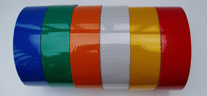
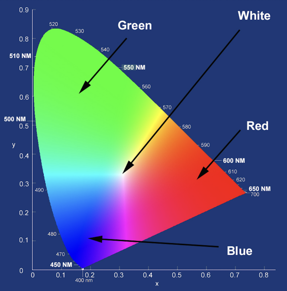
The colors of sign sheeting are measured in terms of Chromaticity. As stated above, chromaticity is defined as an objective, numerical indicator of the quality of a color that stays consistent without regard to the light that illuminates it. In other words, it is the quality of color of an object, independent of brightness, defined by two coordinates. Color science uses chromaticity coordinates (see image above) to explain and quantify how we determine different colors. It breaks down colors into numbers, or metrics. These coordinates identify colors, and make them reproducible with consistency. Consistent chromaticity confirms that an object emits the color that needs to be seen by a person, and for devices like signs, these standards are very specific.
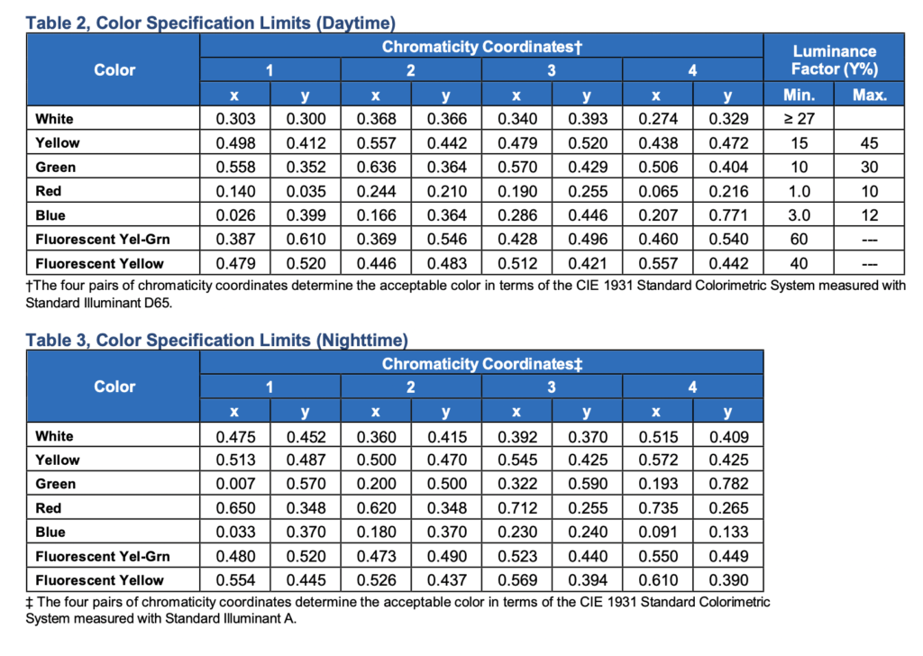
For reflective sign sheeting to be approved for use on roads, interstates, and highways, certain specifications must be met. Daytime Chromaticity (color), Nighttime Chromaticity (color), Weatherability, Reflectivity, Adhesion, Shrinkage, Specular Gloss, and Solvent Resistance are some of these specifications. Of these, Chromaticity is one of the more important metrics, along with reflectivity. Because of all these requirements, sign sheeting must be tested for compliance before it is approved. This assures that all reflective films, regardless of the manufacturer, fall within certain parameters. So whether a sign is sheeted with Retro Reflective film from Avery, Orafol, Nikkalite, or 3m, they will look almost exactly the same.
How Chromaticity is Measured
Chromaticity is a made up of two measurements. One is hue, and is described as the property of colors by which they can be perceived as ranging from red, yellow, green, and blue, as is determined by the dominant wavelength of the light. These colors can be quantified in terms of the wavelengths that create them, and for uniformity, wavelength can be objectively measured and quantified.
The other measurement that goes into chromaticity is “colorfulness”. Colorfulness is the attribute of visual perception according to which the perceived color of an area appears to be more or less chromatic. This just means that color is dependent on more than the wavelengths of light that are being reflected to the human eye. It also depends on the intensity of the light falling on the surface that is reflecting it. During tests for chromaticity for sign sheeting, a constant level of a certain kind of light is maintained for uniformity.
So how do they keep tests consistent with each other? When testing Chromaticity, a “CIE D65 Standard Illuminant” compliant light source must be used. It simulates the color of sunlight on a slightly hazy day. 4 tests are required and the results of each are recorded to qualify a material to meet ASTM color specification standards.
Eye Sensitivity
The perception of color by the human eye is the one factor that engineers have no control over. The perception or recognition of color begins when light hits the retina, which contains photoreceptors called rods and cones. Rods are more sensitive and are responsible for low-light or night time vision. Cones are not as sensitive as rods and are responsible for our day time and color vision. As light strikes the photoreceptors in the human eye, a nerve impulse is sent to the brain, which interprets the light according to its color.
Note – Numerous studies have shown that Fluorescent Lime is seen by the human eye more predominantly than other colors. It has also been shown that Lime and Red together provide the best contrast and result in the quickest recognition. This is why you see lime and red reflective striping used on the backs of fire apparatus and emergency vehicles.
Summary
In summation, color chromaticity standards and shape assure that people recognize the intention of a sign both day and night, prior to being able to read what it says. Both the shape and color of the sign assist in making this happen. It is for this reason that all 50 states require conformance to ASTM color and reflectivity standards when it comes to reflective sign sheeting.
Not all reflective tapes have to meet these stringent standards, only sign sheeting. Other tapes are used for a variety of other purposes, such as vehicle conspicuity and marine safety. For these tapes and applications, other regulations often apply that regulate their color, pattern, etc..
![]()
Steven Cole (Economics, MBA – University of West Florida , Business & Innovation – Stanford University) 25 years of experience in the reflective safety business. Specializing in vehicle accident and rear end collision reduction through increased visibility.

